Layers. You’re going to get so tired of hearing me preach “decorate in layers” – but I promise, there are more benefits to this practice than you can imagine.
The layers of a room go something like this: architecture and ceiling, flooring, upholstered furniture, accent fabrics, non-upholstered furniture pieces, wall art + accessories, and finally plants + lighting.
Layers are so important because when you purchase items for a room without a plan in mind, it may not flow as well as if you had put some thought and planning into the space and taken note of what the space actually is missing.
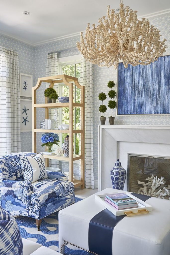
For now, we are focusing on how to incorporate color + texture into your interiors. This can be done by incorporating many of the seven layers of decorating that were mentioned above.

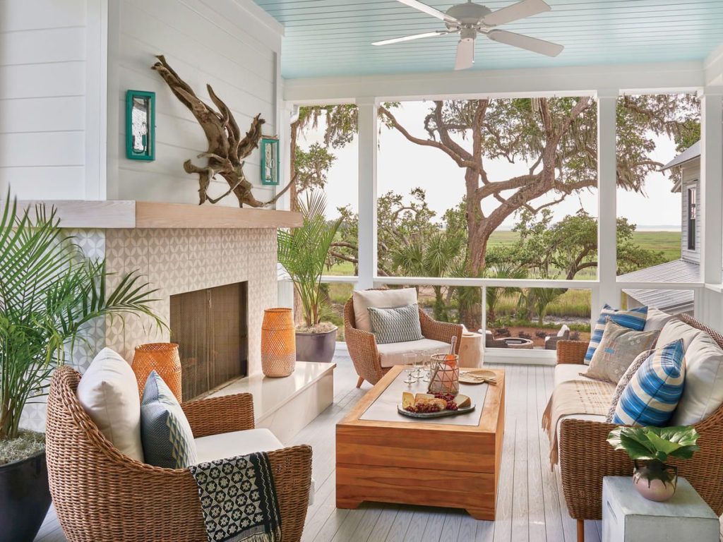
Let’s start at the top: the ceiling, lovingly known by decorators as the “fifth wall” in a room, is often a great spot to inject a bit of color. From the haint blue porch ceilings in the South or a more ornate fresco effect seen in more stately homes, the ceiling offers an additional space for color in your home interiors.

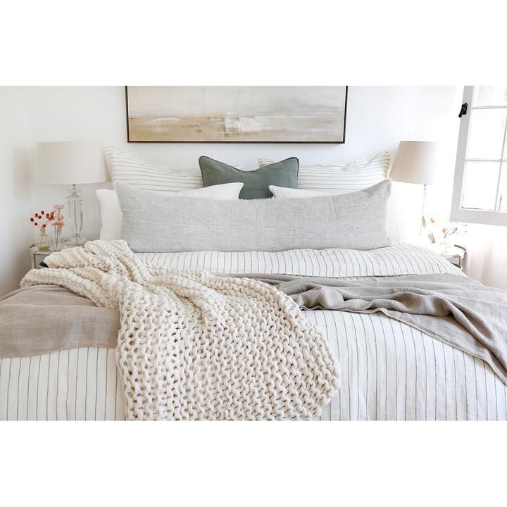
Moving along next will be flooring, upholstered furniture and accent fabrics. Think outside of the box when it comes to the textures available to you in pillows, rugs and couches or chairs. To create an inviting and cozy effect in a large dining room, it might be an excellent idea to utilize a velvet fabric to cover your wood dining chairs. Velvet evokes a feeling of comfort, luxury and opulence. Maybe you’re not looking for opulence, but it does add an element of juxtaposition which is the unexpected, in a room which then lends itself to creating an additional layer to a space. Throw pillows can be found in a variety of fabrics, from cotton to silk-blends, even grain-sack and canvas. Consider carefully the environment of your room (especially outdoors), the type of durability needed for those textiles (children and pets), as well as the balance of other textures. It’s never good to go with a singular texture in your pillows, so don’t be afraid to mix it up a bit! When you vary textures, it adds depth to a room and that is an important element in creating a layered and curated space.

What about those infinite options that exist which fall under the “non-upholstered furniture” category? These items may include side / accent or coffee tables, ottomans, lamps, buffets, consoles or entertainment centers. Textures abound such as glass, ceramics, metals or woods and come in a multitude of colors. If you’re a bit gun shy about adding in major color to a room, a ceramic garden stool is a great start. It serves well to add texture, functionality (great for a drink or plant holder) as well as it’s size, is small enough to be nestled between furniture so it won’t be the first thing your eye travels to when you enter the space. It’s more like a pleasant small surprise once the eye finds it!
Wall art + accessories are my personal favorite, so much so that I have a closet of accessories + wall art that I frequently “shop to swap” in my own home! When it comes to wall art, Brittany is a fan of supporting local, as always! Check out stores like Etsy or your local art + farmers market for affordable and local pieces. Mixing art styles is a very personal act that truly relies on allowing your authentic style to come through. If you’re stuck on what flows well together, we’re happy to guide the process. Never be afraid to intersect your own (or your children’s) art into your home for added personality. Accessories are the jewelry of a room and the amount in each will vary based on your personal tastes. Some people enjoy the cluttered look of many accessories in a grouping, while it may cause others absolute visual stress. The key to choosing accessories is to photograph the space you’re considering adding accessories to, then measure, and finally you can go out to shop. Brittany loves dashing to the nearest antique store for some unexpected treasures to blend in with more modern accessories. Again, accessories offer an opportunity to display family heirlooms or treasures from your travels. Grouping like items in vignettes keeps the accessories from appearing random or misplaced in your overall interior decor.

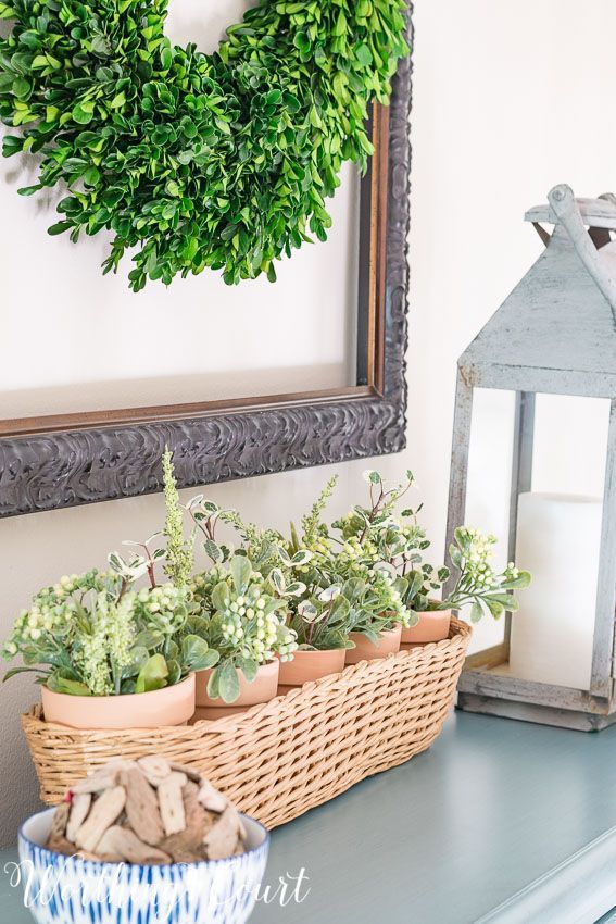
Last but certainly not least, we have plants and lighting. Plants, whether faux or real, offer a great change in texture for the eye as it settles in a space. You can even pair multiple textures by adding a brass antique planter with a very free-flowing plant like a Pothos, again taking the formality of brass and mixing it with the relaxed foliage of Pothos. Faux plants come in a great range of colors, which is also great to keep the eye “guessing” in a room. Please don’t feel like all of the greenery in your room has to be the same color. When adding lighting to a room, be sure to choose lighting for the most common tasks: reading, overhead, and ambient light. This usually translates into a table lamp, floor lamp and overhead or picture lighting. For added texture, look for lighting made from metals, glass or even wood finishes. Again, do not feel that all of the textures in a room need to be the same. It’s perfectly imperfect to mix two metals, have two complimentary tones of wood, or even to incorporate an acrylic or glass piece into a traditional room. It’s all about “The Mix”!
Creatively,
Bee
Be the first to comment