")
You’re back for Part II on creating your complete Home Color Story. Last time we left off with selecting a go-to color that makes an appearance in each room.
Now we’re diving into the “designer details” which involves selecting warm, cool, and accent colors that are not part of your go-to color!
Design encompasses pushing past comfort zones to create comfortable atmospheres, so even if you don’t naturally tend towards warm or cool colors, trust us when we say that the juxtaposition makes for an even more beautiful space. It shows you have confidence in the pieces you’re selecting and colors you’re utilizing, which adds an element of surprise and layers of depth to your home. Afterall, isn’t that why you hire an interior designer?
Let’s jump on in:
Step 5: Pick a warm color that isn’t your go-to color
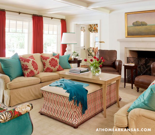
Wondering what a “warm” color looks like? It’s a red, orange, or yellow color (or variation on one of those colors). Warm colors will appear closer to you than cool colors will, so if you have an expansive ceiling or large empty wall, it’s a great opportunity to paint it a warm color to bring a bit of playfulness and joy to your home. Another great way to introduce a warm color is to use it in an extension of your go-to color, ideally in a visually adjacent room.
Step 6: Pick a cool color that isn’t your go-to color
Cool colors are shades of green, blue, and purple. The only primary color that is a cool color is blue, so any hue with a blue undertone is considered a cool color. Cool colors feel restful, laid-back, and understated. Don’t get me wrong, you can absolutely still select a saturated cool color, so don’t lock yourself in to thinking it’s all lilac and pastel Easter-egg hues!
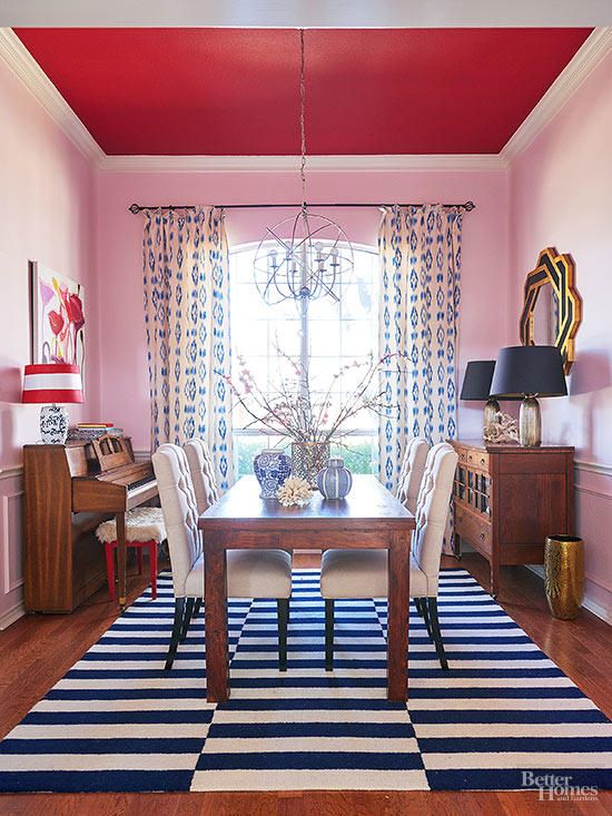
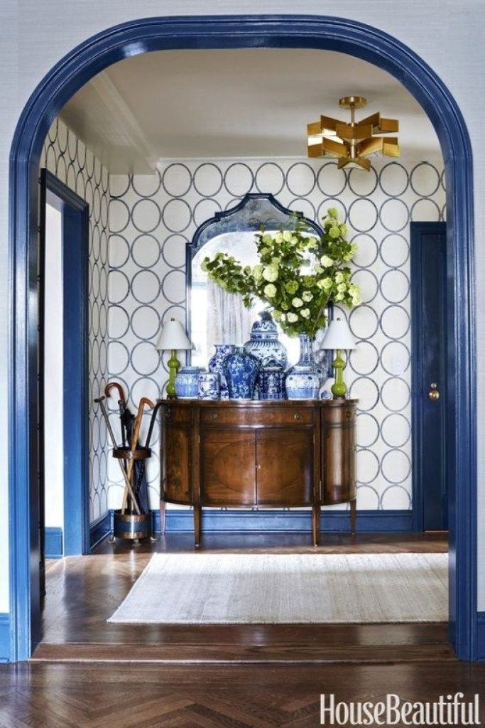
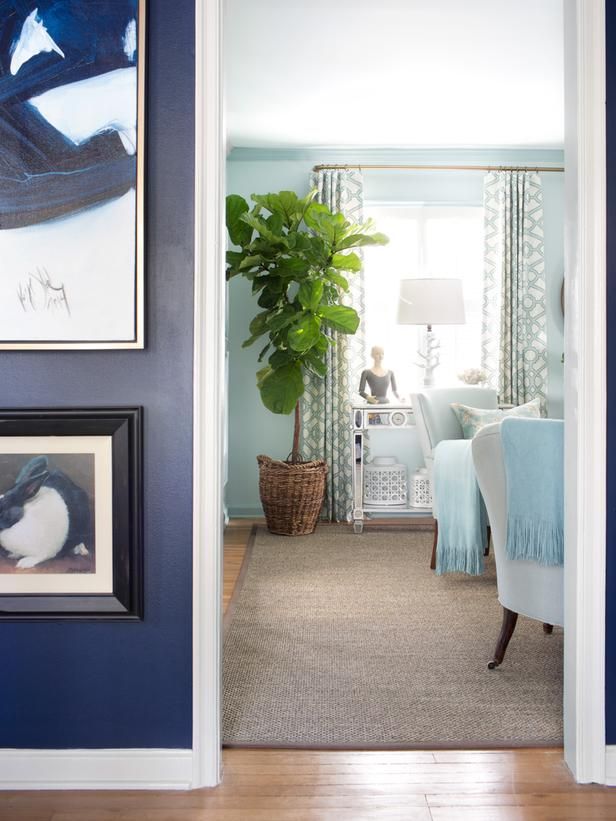
One way we love to bring in cool (or warm) colors is by painting the trim work around the ceiling and doorways. It’s an unexpected pop of whimsy that makes a statement without a huge commitment. This photo exemplifies using colors in opposite ways in visually adjacent rooms!
Step 7: Select an accent color
Accent colors should be used sparingly and create a certain feeling or vibe of a room. Accent colors are great on fireplaces or small ceilings (powder bath), can also be brought into each space through the use of fabric and rugs.
Step 8: Pick a Neutral Color with a warm or cool base tint
What are fixed elements? Simply put, they’re items that aren’t changing in your home (flooring, backsplash, countertops) at the same time you’re painting.
If your fixed elements have warm undertones, select a warm undertone neutral to match, unless you want to create contrast, then choose a cool undertone neutral
If your fixed elements have cool undertones, select a cool undertone neutral to match, unless you want to create contrast, then choose a warm undertone neutral
And not to confuse you even more, but neutrals can be warm whites, cool white, or greiges with varying undertones. Our best advice is to determine if you’re going for a dramatic / contrasting effect when selecting neutral colors then go with the opposite undertone of your fixed elements.
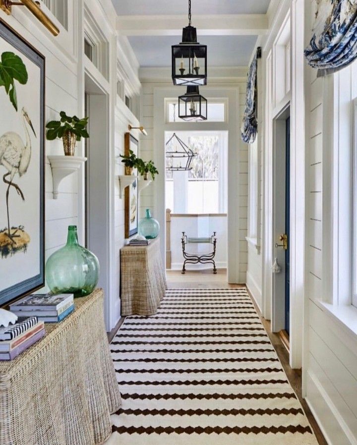
Step 9… we’re almost there …Create a list of rooms that are visible to each other throughout your home.
Ideally, rooms that are visible to open spaces or one another should share 2 colors from your Color Story. This brings in the purposeful nature of decorating a home to feel cohesive. It also allows the eye to pick up on decorative elements that are in the same color family from outside the room, giving greater visual interest.
And finally,
Step 10: Create a list of hallways and other small areas that you might like to remain neutral.
These can be bathrooms, laundry rooms, and hallways.
Now if you’re not afraid to use a more saturated and bold color, these can also be done in hues such as navy, hunter green, and black, especially if your color story leans more neutral and light. Again, the juxtaposition against the light and airy spaces will act as a means to ground the space, which is important in tying together all the elements in your space.
Now, grab those peel & stick paint samples (We love Clare Paint & Backdrop for their low to zero VOC paints that are delivered to your doorstep!)
We’ll see you back on the blog next month!
Bee

Be the first to comment