Week Two: The Design Breakdown
One Room Challenge kicked off last week and I’m so excited to be already connecting with other creatives who are revamping their homes! This past week I was featured on ORC’s Instagram Stories and through that, met a few new followers. If you’re new here to the blog, THANK YOU for being here!!
It means the world to me to be able to share my personal creativity with the world, outside of client projects, where I can use our own home as a bit of a “design incubator” if you will.
This week I’m going to break down the design elements I chose to incorporate, in the same manner that I design for clients – through the lens of beauty – functionality – thoughtfulness.
The Why
I think I made it pretty clear last week my why was the moment my husband asked for more color in our bedroom! I had been sitting on this gorgeous Thibaut “Dahlia” pattern (either in wallpaper or fabric) and knew instantly, it was the jumping off point for our master bedroom. I also wanted our room to feel like a retreat, keeping it light and airy, somewhere you could walk into that would be equally relaxing and invigorating. Decorating with greens and blues adds color without feeling too bold. Another “why” in the design elements for our room, is that I wanted it to flow cohesively with the rest of our home, but for the patterns and colors to be a more subdued version of everything else in our home. ((And if you don’t focus on creating a cohesive home, you are wasting tons of money because one of my favorite ‘hobbies’ is to shop my home and move decorative elements from room to room. And it totally revamps a space for free!))
The Design Elements
Walls: We’re a Navy family so we often are living in a rental home – cue the white walls. The bedroom walls at our little coastal cottage here in WA are clapboard where our headboard is placed, so I knew we couldn’t go all out and add the bed cornice or framed wallpaper panels just yet. But the walls would be my favorite soft white “West Highland White” x Sherwin Williams if we were painting. And we will, one day in a more permanent place.
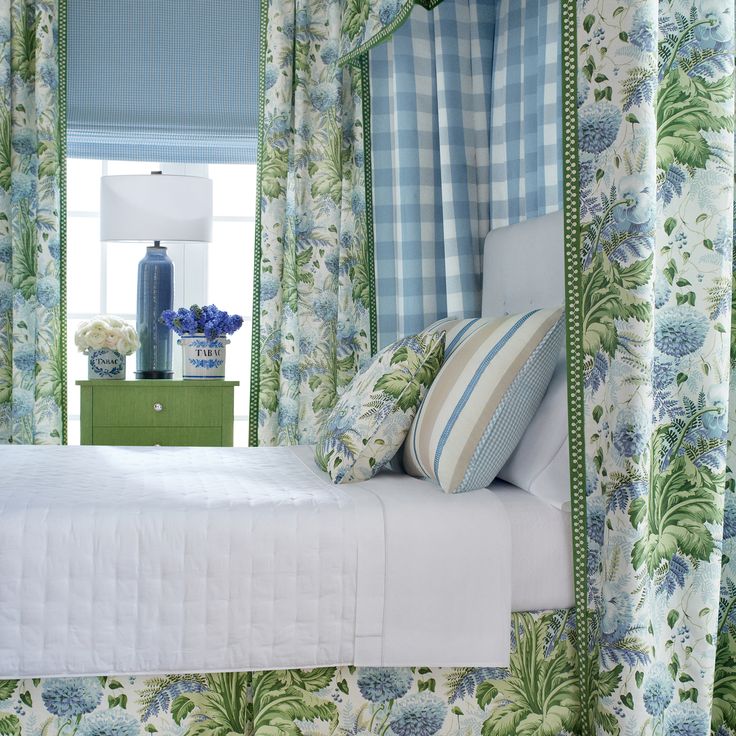
Fabrics: Again, Thibaut’s “Dahlia” was my jumping off point after I fell in love with those blue gingham Euro shams from Dillards Southern Living Collection. Most of my designs start either with art or a fun fabric and this one was a no-brainer. I am also incorporating a small-scale geometric, a textured solid, and a large-scale gingham. The retail-ready drapes will get trim added, as well. The existing matelassé coverlet and king shams add a classic texture to our room, but I will be adding a luxuriously fluffy duvet at the bottom of the bed from Ballard Designs.
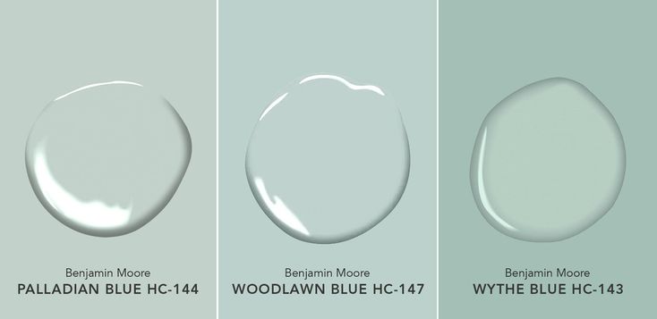
Accent Colors: I chose to blend my own custom color with Benjamin Moore that is a springy green with blue undertones. It’ll be used on our nightstands to help break up the “bedroom set” vibe as well as these sweet little cane back chairs (that have lived in nearly every room in our last 2 homes and been recovered and painted now 3 times… whoops!). Ultimately, I made the custom green so that it would blend well with our other furniture, since these chairs are flexible in multiple rooms and ideally we’ll have a pair of upholstered swivel chairs in our master or a sweet little antique settee (one day…) Again, by adding color in the elements we “take with us” on each military move, I am intentionally avoiding living in an all-white-walls-home! To me, the investment in paint and fabric is well worth it for a family that moves as often as we do!
Furnishings: The matching bed-dresser-nightstand look is not for me. I know some people love the ease of it being done for them, but I am moving in the opposite direction. My initial thought was to create a slipcover for our headboard and have a local workroom design and create a removable bed skirt so that when we move, I could easily remove the upholstered parts for safe travels. I’m still looking at new beds, but with the looming holidays, upholstery work is getting backed up and I might not find the bed I want, in time for the challenge to end (and have photos done).
Lighting: While limited on the options for swapping out lighting in a rental home or adding hardwired sconces, I am going to stick with finding a pair of vintage lamps that I can add a fabulous detailed shade. If time and resources allow, I’ll add a pleated colored shade or a solid shade with trim detail. The current lamps are too modern for the Fresh Traditional look we’re aiming for.
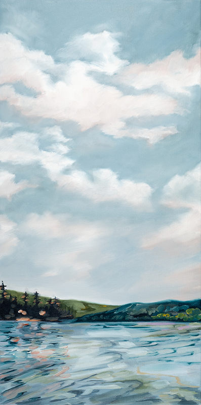
Hardware, Drapes, Art & Area Rug: Living in new cities offers me the opportunity to find local artists and makers, adding to our collection of original art to serve as a visual reminder of the beautiful places we’ve been sent with the Navy. I found an amazing local artist, Lindsey Kiniry, at the Anacortes Art Festival back in August and selected six of her pieces to use in a gallery wall in our room. These abstract landscapes lend a bit of color without locking me into anything specific in the room, and being able to add more art over time.
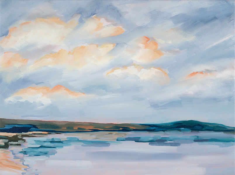
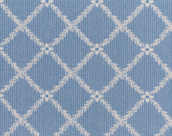
The hardware I’m using is by Liberty, a classic shaped champagne bronze pull and knob combination. The drapes are from Wayfair and come with pinch-pleat tape already sewn onto the header, so I’ll use an Amazon brand drapery pin, ring and hook combination to create pinch pleated drapes on a budget. The area rug will be an existing piece that we previously used in our living room, but I’ve got plans to customize another design from our newest rug guru that will eventually make its way into the master!
Final decisions are being made, samples and drapes have arrived, and I’ve found the most amazing furniture painter so we’ll be getting those items glammed up ASAP.
Stay tuned for next Wednesday’s update, check out the other designers and DIYer projects for
ORC Week Two and head over to Instagram and Facebook for some behind-the-scenes to our project.
xx
Brittany “Bee” Zimmerman
Going to be beautiful. Is that fabric you have posted under the photos of art? Love it. Source??